Inspired Solutions For Plastics
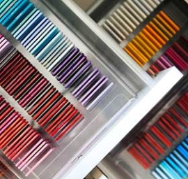
When it comes to the creative application of color and special effects in product design and branding, ColorWorks™ centers are an invaluable source of ideas, inspiration and technical guidance. At any of our five global ColorWorks centers, brand managers and designers work with our dedicated team of experts to establish high-impact color concepts at the earliest stages of product development. Focusing simultaneously on aesthetics, functionality, color efficiency and project coordination, ColorWorks helps you heighten shelf impact, differentiate your brands, control costs and time-to-market, and manage color across multiple resins.
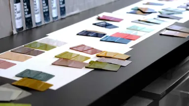
Maintaining color consistency across multiple resins sourced from different suppliers in countries around the world is a complex task that requires color-management knowledge and global resources. Our ColorWorks team can establish master color standards against which new materials may be evaluated, and distribute these color references throughout your supply chain. Our experts can evaluate materials submitted by your vendors to confirm that they meet your specifications. And with our color-management services, you are assured that the color you’ve selected will be faithfully produced – part after part and time after time.
To learn more about how these services can add value to your next project, contact:
|
Asia |
|
|
Europe Middle East Africa |
|
|
Latin America |
|
|
US/Canada |

What We Do
ColorForward™
ColorForward™ Color Trend Forecasting Tool
ColorForward™ is the advanced trends-analysis program developed within ColorWorks to help identify emerging social and cultural influences and forecast their impact on color trends in plastics.
Learn More
New Aesthetix
Innovative Aesthetic Solutions for Thermoplastics
Avient’s New Aesthetix initiative combines polymer science and unconventional ways to look at processing and formulation to deliver innovative aesthetic solutions to plastic materials.
Learn More